10kp is a business consultant group based in Grand Rapids, Michigan, with a mission of helping organizations and individuals find clarity of purpose, develop leadership skills, and get connected with a larger community. I had the opportunity to set them up with fresh, vibrant branding as they started out their business journey.
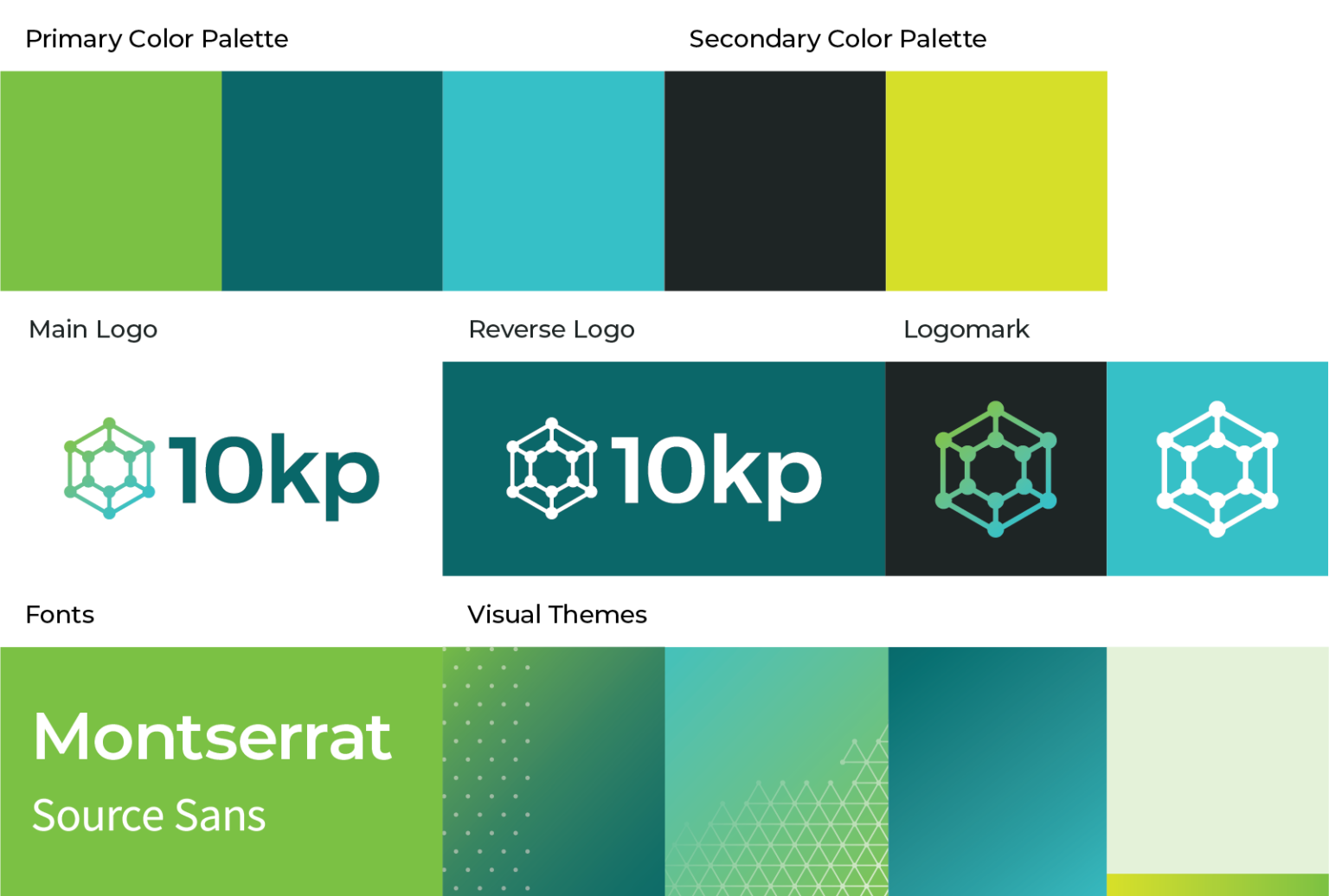
In initial stages of logo design, the group wanted vibrant colors and imagery that evoked a sense of clarity and connectedness. I explored a few options for this, such as arrows, layered light, focus brackets, and color bursts. 10kp decided on a logo mark design which evokes a diamond for clarity and a network for connectedness. We landed on a color palette with bright, eye-catching teals and lime greens.
